


Energy Loops Cereal Packaging Design

View photo in Full image to see the project!
This project was done for an assignment at our school. We were asked to create a packaging design for whatever fictional cereal brand we could come up with.
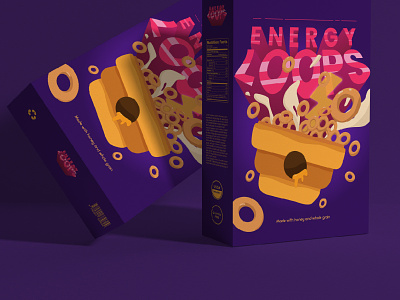
Energy Loops is a cereal brand targeted towards children and teens specifically aged 7-13. It is a product that aims to stand out by having that sweet taste that most young consumers like, all while still being a very healthy option for daily breakfast. Energy Loops uses honey extracts as its only sweetener, making it naturally sweet. Lastly, it claims that it can give its consumers the daily supply of energy they need for their day.
I originally intended to use a yellow monochromatic color scheme for this project. However, I felt that the design was missing something when I had finished it. I thought that it could use one or two more contrasting colors. Hence, the addition of violet and pink.
I chose this typeface because I wanted to make Energy Loops a brand that projected an energetic mood, while also being friendly. The Poppins typeface has both defined and sharp edges and also very round curves that gives the right balance I am looking for.
Energy Loops is supposed to use honey extracts as its main sweetener since it aims to be as healthy as possible for its consumers. I wanted to incorporate two main things in the illustration that the consumer first sees on the box. These things are energy, and honey.
The back side of the box is where the consumer can briefly read information about the cereal’s components and what makes it deliciously healthy. It shows an enlarged vectorized illustration of a single piece of the cereal and a bit of explanation about its contents..