


DailyUI 005- App Icon


Design Hint: Design an app icon. What best represents the brand o product? Or is it incredibly unique? Does it look great at a distance and does it stand out when you put on your homescreen alongside other apps?
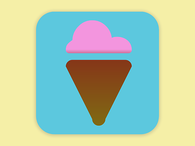
I created an app for an ice cream store where users can order their ice cream online. I went with an ice cream cone so when viewers see the icon they crave that sweet treat and will know exactly where to find it. I went with a simple background to not compete with the gradients I used in the icon itself adding just a hint a realism while maintaining a whimsical feel.