Lilly Cookie Logo Timeline

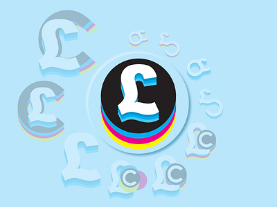
I was trying to create a Logo for myself a new and fresh logo to use. My priorities were to include CMYK on it as it is my favorite colorspace. I started with abstract combinations of the Letters and made Alterations of It and finished with 15 different logo but none of them had enough clarity Except The one I picked. It was Inspired by Cuberto Logo but I wanted to make it mine more. L is in Style I write L myself and L is the Initial for my name.
I started designing for print and I want to celebrate it in my Logo but also be able to Animate it and play with it a little, like creating a motiongraphic.
Also I did chose the colours because of Their Colour Psychology.
Cyan shades and tints that are dominant and mean peace and depth that I take and symbolises also as trust worthy. (That is why we use blues for information signage on streets)
Magenta is a close to me and means carrying, feminine. (Let be honest most of people think it's pink or fushia 😅)
Yellow symbolise Energy, Optimism that I approach people with, especially my clients. (also why we use shade of it on street signs, really grabs attention and sugests stay alert)
By the way my favourite range of colour spectrum is from 380 nm wavelength up to 500 (Aprox. Purple Heart to Cerulean)
Fonts Used: Arial and Caviar Dreams.