


iOS 7 Addendum Icons

See @2x.
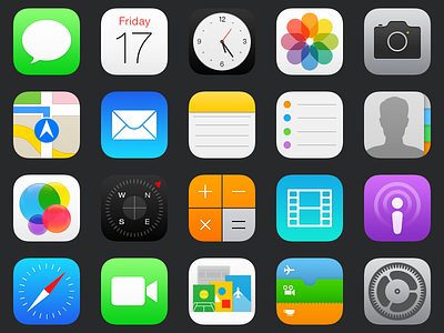
A personal project of mine to 'fix' the iOS 7 icons. I looked at each icon and made an attempt to streamline the original intent behind it without completely reshaping the original.
Some of the general improvements include making elements across different icons more consistent, removing excessive and often eye-straining details, minimizing clutter, giving certain apps more of a focal point, and adding subtle shadows as well as white gradients to glyphs, better helping them stand out against their vibrant base.