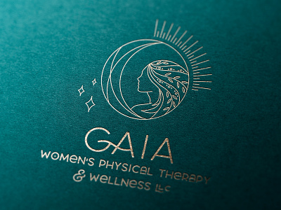
GAIA Logo Design
Gaia is a physical therapy office with a focus on the pregnant, postpartum population with orthopaedic and postpartum conditions.
They provide care holistically with research-based evidence and were looking for their brand to intertwine the concept of holistic care for the active woman.
Gaia is the goddess of Mother Earth who “created her self out of primordial chaos” which we loved because that fits describes motherhood just perfectly! She “is always working to achieve and maintain harmony, wholeness and balance within the environment.” She “heals, nurtures and supports all life on this planet”. She has superhuman strength.
For colors, we felt the harmony of purples, blues, greens with rich jewel-like tones would give the brand the weight and depth Gaia implies. I designed this logo as a custom illustration. We were also striving to include the concept of Mother Earth, hence the combination of sun, stars, and moon, with the woman at the center seemingly having hair made of garden elements. She is in profile and conveys strength in her posture and presence. The font is an existing font, LaRosa but I felt it really conveyed the spiritual elements of the brand and had just the right amount of flair while still maintaining legibility. While the illustration can be complicated, I was able to provide a descending set of icons for the smallest use cases.


