LO w Trzebnicy - logo idea and construction

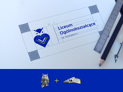
In my proposal I wanted to maintain the overall look of the current symbol (similar colors, shape) but make it more modern and minimalist. I came up with a clean and balanced mark consisting of three elements (book, heart and owl) that can be used separately in the visual identity of the school.
Behance presentation of the whole identity system:
https://www.behance.net/gallery/101027755/LO-w-Trzebnicy-visual-identity-of-the-school