


Color palette for athenaOne mobile

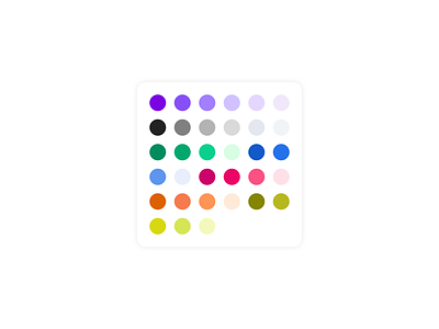

We've been working on blowing out the color palette for the athenaOne mobile design system into a comprehensive spectrum for each colorway. The primary app colors are purple and grey with a suite of accents needed for statuses and alerts. We worked to balance good contrast compliance with readability of hues. The palette includes a consistent set of values for the main value in each spectrum, and mid tone on tone value, light background value as well as darkened value(s) in each colorway for use on text against backgrounds. While this palette is optimized for light mode, it appears to have good potential for direct use on dark as well.