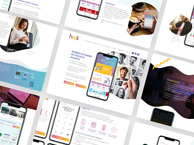
Hooli website - UX/UI

Hooli is a fintech specialist, gives bank solutions with biometric security to the users and merchants.
I was lead web development and user experience & interface (UX/UI). The website was developed with the last technologies and stays optimized to the correct visualization for multiple devices (responsive design).
The Hooli website looks interactive and give constant information to users.
I worked the structure in each section to ensure the content decodification. The interface haves brand elements and organic forms helping to equilibrate the layouts.
The chromatic pallet was a desition to create dynamism, variability and represents the different characteristics to people. I was do what to users feels integrate with the brand.
I uses Roboto typography. It`s a dry stick typeface that don't compete visually with the elements and it is very easy to read. Also is a native font in Android and this integrates the users with the ecosystem.
Every element in the interface taking lives with motion-ui, an important methodology to guide the users and create a flow in the interaction. An important detail was use videos that respond to the navigation. This videos look different actions and functionalities on the mobile app for introducing to user in the benefits and usability.
For view the website enter in https://hooli.la/
----------
Hooli es una fintech especializada en dar soluciones bancarias con seguridad biométrica a sus usuarios y comerciantes.
Estuve a cargo del desarrollo del sitio web junto a la experiencia e interfaz de usuario (UX/UI). Está desarrollado con las últimas tecnologías de desarrollo web y optimizado para su correcta visualización en múltiples dispositivos (responsive design).
El sitio web de Hooli busca ser sumamente interactivo y brindar información constante al usuario.
Estructuralmente se trabajó cada sección de forma individual para asegurar la decodificación del contenido. La interfaz cuenta con elementos característicos de la marca sumando detalles visuales con formas orgánicas que ayudan a descontracturar equilibradamente los diferentes layouts.
La paleta cromática implementada fue en base a una decisión para generar dinamismo, variabilidad y representación de las diferentes características de las personas. Intentar de que cada usuario se sienta reflejado en la marca.
La tipografía utilizada es la Roboto, una fuente palo seco que no compite visualmente con los elementos y es muy fácil de leer. Además, es la tipografía nativa utilizada en Android y esto integra al usuario en el ecosistema.
Cada elemento de la interfaz toma vida mediante motion-ui, una metodología muy útil para guiar al usuario y dar fluidez a la interacción. Un detalle muy importante es que se incorporaron videos que responden a la navegación. Estos videos muestran diferentes acciones y funcionalidades de la app, introduciendo visualmente al usuario en los beneficios y usabilidad.
Podes ver el sitio web en https://hooli.la/