


Hotel Branding - Darshan Por

Behance | Instagram | Pinterest | AliCkreative.com
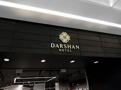
Hotel Darshan was established in 2011 at Baroda. It's one of the most popular family restaurants in Gujarat and around Por known for Chinese & North Indian food. Hotel Darshan's symbolic logo visualizes the first letter's combination of the Darshan "D" and Floral Art. This unique symbol depends on the circle shape in its design in order to express the infinity and sustainability concept. Secondly, the logo displays the majesty and royalty image by adding a lily flower symbol on top of the "D" combination to reflect the high-quality, luxurious service at Darshan Hotel. They have already established trust and built confidence with their customers. But in order to stay contemporary and fresh and keep up with market changes, they decided to evolve their corporate identity. We were therefore tasked to bring new life into the brand. The new identity has to reflect the brand’s personality and tell the company’s story in a way that creates excitement & loyalty.