Uzhin Doma

We continue to talk about the rebranding Uzhin Doma.
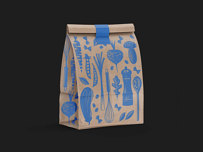
We refreshed the corporate color, a dark blue, to preserve brand recognition. A pattern was chosen to reflect the company’s activities: the texture of the elements in the pattern was drawn by hand, giving a sense of independence and cozy domesticity.
We prepared branded items for the service to use both online and offline, including gifts for customers.
See more of our work → www.behance.net/nimax