Supplement Site Redesign


I am redesigning an e-commerce site for a natural supplement. Based on a review of analytics and interviews with product manager, the audience is largely men 45+. I also completed a heuristic review of the site and a competitive analysis.
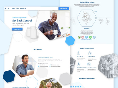
Based on the research, I put together this mockup. I tried to make the page clean with a clear message of health benefits. I wanted to treat the product as a medicinal alternative. To support that message I incorporated natural building blocks of hexagons, focused on mostly blue colors to elicit a sense of safety and a nod to medicine, and made use of plenty of white space.
I would love to hear what you think.