Phôfinho Business Card

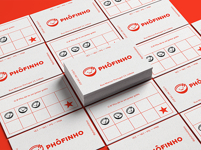
A while back, I designed the visual identity for a pho restaurant in Lisbon. The name is sort of a pun with the word "pho" and the word "fofinho"— which means cute in Portuguese. So obviously I couldn't resist adding cuteness in the brand design :) The logo brief clearly stated that it should look like it could be a chain restaurant but also have a cosy dining spot feel to it so you don't lose the authenticity factor.