Youtube Redesign


This is my vision of the Youtube video page.
First of all, i know that i don’t have any ideas about the whole context , Youtube has strong ergonomists, usability tests, designers, analytics to make the interface become better and better. I am not saying it is better, and i didn’t include all aspects. It's just like concept cars. You can still come up with ideas, even if it is not going to be a real car, you can take inspiration for real one.
So Here we go :
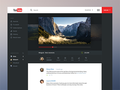
✔ A darker interface, to reproduce the cinema experience. The interface could be white, and fade in black when the video starts (cinema experience).
✔ If the author has other videos (like a playlist), you can go to the previous video by clicking the video on the left (on the background). Same interaction for the next video.
✔ The play button follow the slider, it’s cleaner. But then, i noticed that it wouldn’t be a good interaction for small video, where the slider go fast.
✔ Volume, settings, subtitles etc appear when you move the mouse
✔ The description of the video should be like the first comment. Like Dribbble :)
✔ I try to keep the header consistant with my last shot (google redesign, external consistency ? )
✔ I didn’t include a lot of important features, because it wasn’t my point for this shot. Like recommended videos, which is one of the core aspect of Youtube to keep users on the site, and for ads. I wanted to present some ideas, without pretending to design the new youtube.
I took some inspiration from Erixon for the sidebar (thank you).
Comments, feedback, likes and follow are welcome
Have a nice day :)
Also take a look at my iPhone app