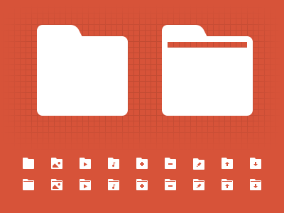
Folder Icons
Currently working on a huge 16x16 iconset. Since I can't get rid of my pixel-perfectionism, what do you guys think, should I go with a simpler version of the base folder icon or the one with the line. It gets complex when additional graphics are added inside the base icon, so I kind of aim toward the simpler one, although the latter seems more unique. What are your thoughts on this?
More by Zlatko Najdenovski View profile
Like

