RISE logo

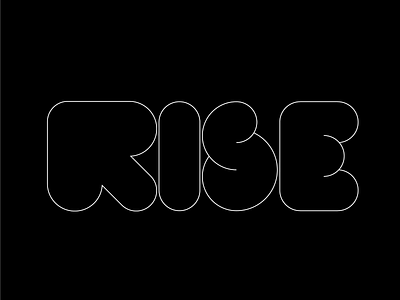

Created a type treatment for the name of a new product launch. Introduced an arrow to take the place of the R and also shaped each letter to represent the creamy texture of the product being represented.
Created a type treatment for the name of a new product launch. Introduced an arrow to take the place of the R and also shaped each letter to represent the creamy texture of the product being represented.