


Pop Corn Truck

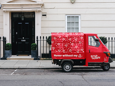
And here are the Pop Corn mockups with a new design and packaging. So I decided to go for a very fun, energetic graphic line while having this "pop" side of the brand and its product. With these geometrical shapes, these broken lines or segments, it adds a real asset and an almost dancing side to the packaging. It also fits very well in this universe and especially in this logo. Offset but completely understandable, it allows this logo and this packaging to reveal and distinguish itself in order to show the uniqueness of this product. Moreover, this graphic charter applies extremely well on all types of supports such as a Tote Bag or even a vehicle. This small, compact and fun three-wheeled vehicle is in line with the Pop Corn theme, that's why I chose it. Applying the graphic line on it, it keeps its charm and becomes a new and recognizable communication support. ———————————————————— 🌐 My website : https://hurtikonn.wixsite.com/hurtikonngraphic ————————————————————