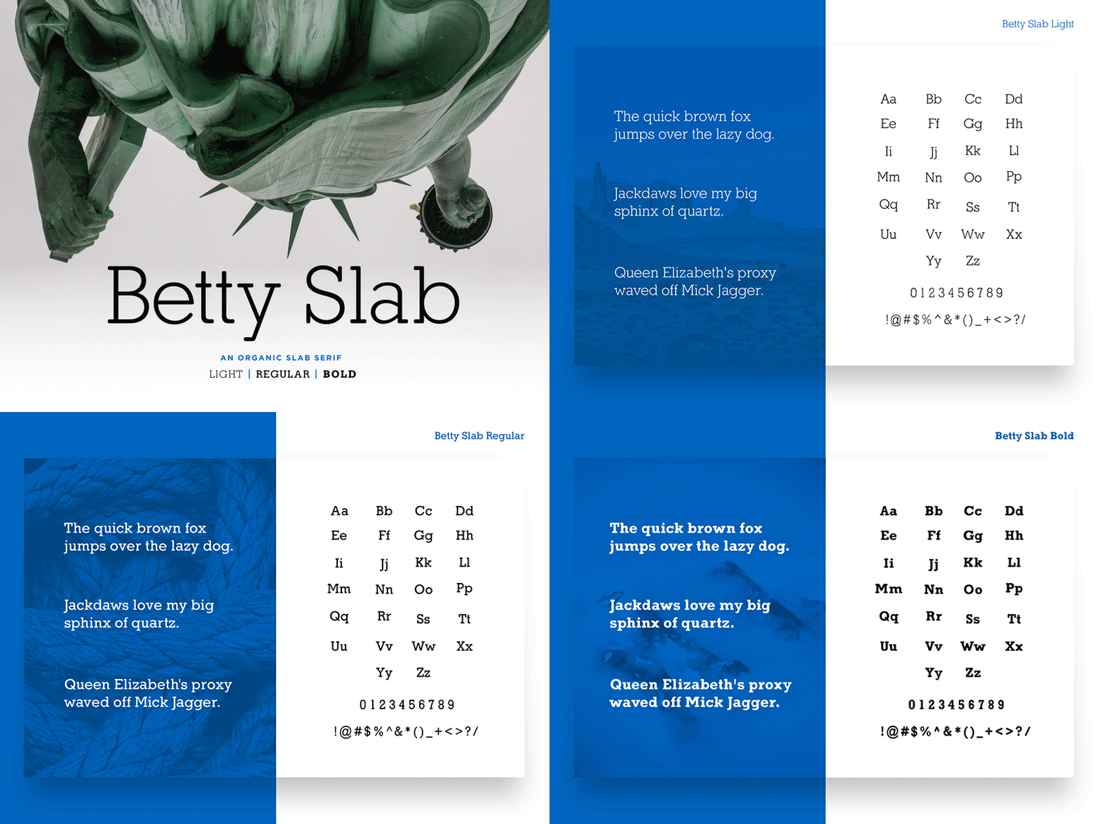
Betty Slab - An Organic Slab Serif
Get Betty Slab at Creative Market - https://crmrkt.com/WRdekD
------
TL:DR - Think of Betty Slab as if Memphis, Beton, and Rockwell had a baby then mix in some curves and rounded terminals. It delivers a clean organic look without appearing too bubbly and losing that slab punch.
------
Betty Slab was the slab serif that I had always been looking for. I love slab serifs for titling and brand work, but my clients rarely did. The bold nature of the slab serifs are great for packing a punch, but I needed something more organic and approachable, but I also wanted to avoid making something that was too rounded as I don’t believe the world is begging for another Courier. So, I began experimenting with Fibonacci curves for a less geometric feel on the terminals. I ended up going with the 8th curve (3+5=8) split into thirds and designed from there. The serif terminals themselves were shortened to lighten up the weight of the characters. The result is a lighter, more pleasant read, with the same attention-grabbing forms of a nice strong slab serif.
Why Betty? It was my grandmother's nickname. Elizabeth “Betty” Geiger was a tough but kind woman that has always held a warm spot in my heart. The perfect persona for this typeface. I’d always wanted to dedicate something to her memory… but never had made anything significant enough to honor her with. It’s my hope that Betty Slab will be a long-lasting memorial in honor of my beloved grandmother.
I hope to continue to build out and perfect the family but wanted to release the first three weights into the wild rather than keep them in a holding pattern. This return to font creation has been a long time coming, since my grad school days at SCAD, and I hope to be typographic work in the future.


