


mot serif display bold

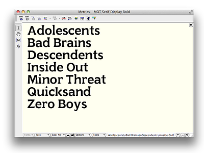
Continuing work on my MoT Serif revival from David Kindersley's UK road sign proposal. When finished, I'll have a display weight and a more romanized text weight (w/ bold). This typeface features exaggerated serifs to emphasize legibility from a distance.