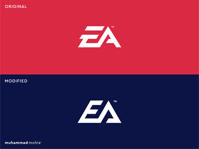
EA logo rebranding
My take on the EA logo rebranding!
I decided to create a light rebranding of the Electronics Art logo because the letter E in the original design is not only not readable enough but also it seems to be letter F!
Let me know what you think!
Looking for a stunning logo (re)design?
I'm open for new freelance projects.
Feel free to contact me.
branding
design
electronics art
gaming
gaming logo
lettermark
logo
logo design
modern
monogram
redesign
tech logo
View all tags
Posted on
Jul 7, 2020
More by muhammad mohie™ View profile
Like


