


Pages - Jubail Island


Greetings 🤗
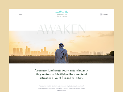
Although we received a color palette for the Jubail Island website, we wanted to translate it into the story, so we created a theme for each one. When the website structure was created, we had three pages in the navigation, so we assigned a color for each one.
1. Awaken - shows the nature and the unique location of the island, close to Abu Dhabi, but doing its own thing. Sand gold is the color theme for this one, symbolizing the richness of nature and wildlife.
2. Discover - is all about the master plan, and what kind of properties and neighborhoods will be there on the island. We implemented the sky blue color for the discover page, emphasizing calmness.
3. Settle - information about the properties, townhouses, renders of the interiors, and so on. Since green is associated with safety, this was a clear indicator that we should use the calm green from the color palette for this page.
How do you pick colors for your designs?