Designing a Checkout Page | AVENUES Digital

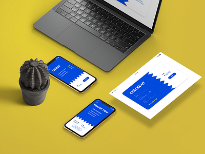
For the second day of the #DailyUI challenge, we were assigned to design a checkout page.
Today's idea was based around a more corporate look with a few modern details.
The most important part for me was visually separating the "order" and "payment" parts, as it allows the user to look over their order more easily, and thus allow them to have more control over their purchase, in case they have made a mistake or changed their mind. Less confusion and more readable pages allow for smoother user experience.
You can see the design prototype here: https://www.youtube.com/watch?v=G2lQT8rAqqU.