Moodboard for Propel Re-brand

We worked towards conceiving a geometric brand concept.
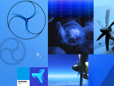
In order to create a dynamic look and feel, we strived to produce a less literal execution of the propeller logomark. To maintain the syngery between the logomark and wordmark, the propeller was created from using the “O” from Propel.
The black and blue color palette, representative
of the blue sky, in total gives a modern and sophisticated look. Also the use of transparencies to represent a spinning motion.
Check out the logo
Follow Us:
Linkedin | Instagram