


Divisin Minimal Triptych // iDrops 08/15 - Logolounge 2020


Trend Report // Typography Logo Exercise ⠀
⠀
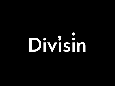
Minimal type interation to convey the idea of division, I've tried to use the dot in a different way of the trend, making kind of a triptych where the drop steps suggests an animation frame by frame.
⠀
Feel free for give me some feedback, is the concept clear enough?. What do you people think? Would be nice to hear what you see on this typography :)
This side-project is meant to be an exercise on the logo trends of the year. As I've said on the previous posts, my motivation is just to study the trends and hopefully create interesting concepts using it as platform, experience some new styles, etc. I hope you enjoy this project with me (feel free for check the 1, 2, 3, 4, 5, 6 and 7)!
⠀
Plus, I've decided to work on a fictional logo concept for each of the sections created for the Logolounge 2020 Trend Report.
So I'm excited to try this new stuff and hope you people are enjoying this quick journey with me as well! ⠀
⠀
Let me know what you think about this work, my friend :)
Feedback is really highly appreciated! ⠀
⠀
The description of the trend I'm following on this shot is above, I'd love to keep the discussion on this topic flow so here goes the text: ⠀
⠀
"I like to imagine the conversations that take place in designer presentations I’m not privy to. After you’ve worked with enough clients you start to recognize some of the signs of client fatigue that lead a designer to give in on this thing or that. I picture the designer whose work has been stripped down to a company name in a lowercase bold sans serif. Dejected and brow beaten after numerous attempts to interject some color or life, the client finally concedes a spot of color on the dot. Of course, this is pure conjecture, not having seen the actual design briefs for said projects.
After seeing too many solutions like Dimple or Medallia using the color dotted i only, I have tried to show a broader range of applications under this umbrella that demonstrate some of the stronger conceptual thinking. Admittedly the lower case i is often cast as the person in the letterform with the dot serving as the head. Often a few extra colored dots on letters that don’t really call for one, help describe the family or a team. Uplight flopped their i and lit their bottom, while Mitto is just burning its i at both ends. Clever." ⠀
⠀
(article excerpt by Bill Gardner) ⠀