A2 ATELIE ARQUITETURA

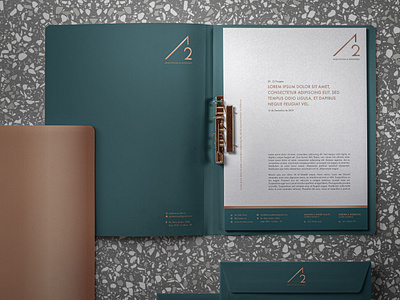
The visual identity of this architectural firm follows the concept of simple shapes and geometric symbols, thus referring to architectural forms. Inspired by the interaction of architecture with the human being, the color palette brings light gray as cement, bronze as metal and teal green as nature and life. The name of the studio is an analogy to the society of two architects and to the A2 paper format, widely used in architecture.