SMP Logo (Question)

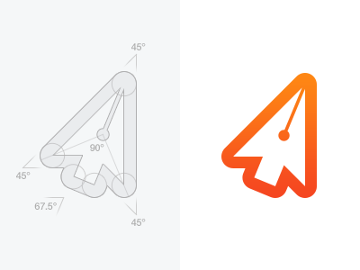
So here's the current state of the SMP logo and I'm very pleased with the outcome.
My question for all you logo designers is - do you think it would look better if I'd applied some kind of grid (if possible), or would you advise not to get too restricted/obsessed with applying grids to logos?