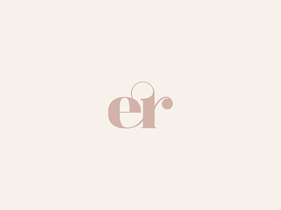
ER Monogram Logomark
The intention was to use the brand initials to create a high-end logomark but with a font style that wouldn't make it look expensive and more targeted at young generations.
The ligature between the E and R is one of the things I like more. And, the shape resembles a heart (see image 2).
Let me know what you think! 💭
—
branding
e logo
e monogram
er logo
er monogram
fancy monogram
logo
logomark
logotype
minimal monogram
monogram
monogram logo
monogram logomark mark
r logo
r monogram
View all tags
Posted on
Jul 2, 2020
More by Sara da Silva View profile
Like


