Flyvinci - Logo / Brand Mark Design

A new brand mark - actually a V & Y monogram, as part of a new logo for Flyvinci.
Founded in Belgium, home of the waffle Flyvinci takes you to places beyond your imagination. From departure to arrival, they offer several products for your trip, so that you can sit back and relax. Flyvinci focuses on the comfort of flight crew around the world.
"Your destination is our flight plan. Your journey starts with Flyvinci."
While the mark was approved immediately, and the brand typography still not being settled, I went through some extra refinements, such as the large curve on the tail derived from the golden ratio.
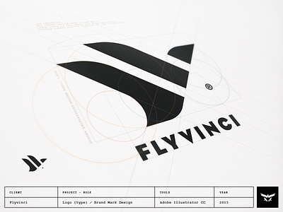
Some technical description:
As you can see from the guidelines, the ratio of the Flyvinci Brand mark adheres to the golden ratio. For those curious students among you, the golden ratio (Greek letter Phi / uppercase Φ lowercase φ) is that special number approximately equal to 1.618, which appears many times in geometry, art, architecture and other areas.
All curves derive from the radii of the circles that adhere from the golden rectangular.
Only 45° diagonals are used to conform the shape of the flying bird (plane).
The shape is also a more abstract monogram which consists of the letters V & Y.
Have a great day to all of you!