Responsive Design for Catalyst Web Brochure Header

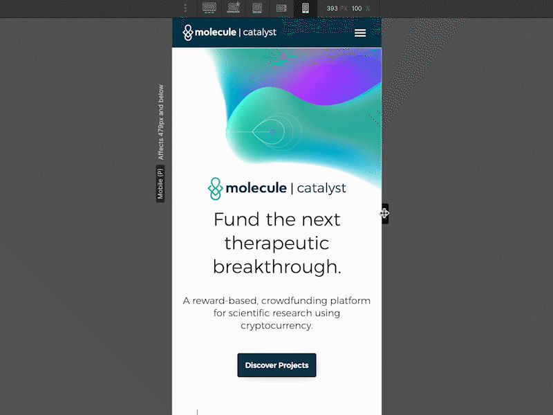
Built in Webflow, I designed and prototyped this brochure page as the landing page for the Catalyst Web app. This is the header - I made sure that the background graphic was positioned well to the text whether seen from mobile or laptop devices.
Here you can see how I made sure it was designed for all screen sizes ranging from 400px-1400px (@x1 or x2)