BB Organic Flip-Flops // Bevel Tips 05/15 - Logolounge 2020


Logo Trend Report // BB Exercise ⠀
⠀
This side-project is meant to be an exercise on the logo trends of the year. As I've said on the previous posts, my motivation is just to study the trends and hopefully create interesting concepts using it as platform, experience some new styles, etc. I hope you enjoy this project with me (feel free for check the 1,2,3 and 4)!
(also I haven't any logo selected for this years publication, so maybe resentment could be a bit of motivation agent here haha) ⠀
⠀
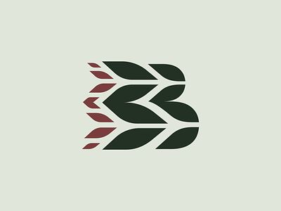
I'm not gona lie: this was pretty much of a play with the bevel tips shapes initially, and then I've saw some natural organization of those as leaves, and a B and so it goes on. The idea come up pretty easily, the negative space reminded me a pair of flip-flops, and so I've imagined to walk by using some flower shoes; can you imagine how would look like a path like that? It could lead you to some beautiful lands and let beghind a flourished track for sure, petals footprint...
⠀
I think this concept could be used as some organic or environmental friendly company/brand, what do you think?
⠀
Plus, I've decided to work on a fictional logo concept for each of the sections created for the Logolounge 2020 Trend Report.
So I'm excited to try this new stuff and hope you guys enjoy this quick journey with me as well! ⠀
⠀
The description of the trend I'm following on this shot is above, I'd love to keep the discussion on this topic flow so here goes the text: ⠀
⠀
"Each trend report manages to identify a shape or two that rapidly populate every designer’s kit of parts like words that enter the news cycle based on a sheet of talking points. Every pundit uses the phrase like it spontaneously leapt to their lips, and every designer uses the shape of the hour with the same impromptu reflex. The best I can do to identify the cause of this eruption is to look at the previous year’s trends and designers’ affinity for the use of canted parallelograms. Those previous shapes strongly resemble this year’s crop, but these shapes have approachable, organic curves.
For each rounded bend there is a counter corner that draws to a point like the tip of a leaf. No surprise that this shape has found its home in a number of marks that are eco-centric and hope to reflect the language of nature’s building blocks. Foliage, feathers, grain, cresting waves or any number of other receptive contoured forms. This shape stacks, reconfigures and pairs well with other soft shapes or blends with harsher geometrics to soften their effect. It serves as a refreshing addition on a number of stiff sans serif fonts, to add a wisp of nature" ⠀
⠀
(article excerpt by Bill Gardner) ⠀
⠀
Let me know what you think about this work, my friend :)
Feedback is really highly appreciated! ⠀