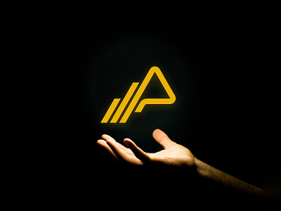
The Pro Team Final Logo Design
Here is the final logo design for The Pro Team. TPT have been offering mental and physical training services to their passionate community of followers for over 8 years, aiming to help people reach their maximum potential in all aspects of life. The business operates in a unique sector, bridging the gap between conventional fitness and lifestyle coaching.
Our goal was to create a unique and modern abstract symbol with the potential to evolve into an attractive apparel brand, embodying the business and their audience.
The symbol uses a triangle as the key focal point, a shape that represents strength and power. Increasing line heights are similar in form to a progressive bar graph, symbolising achievement and forward momentum. The extension of the triangle also creates an abstract letter ‘P’ for Pro.


