Three Bears Ice Cream

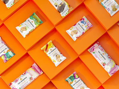
The key task of the agency was to integrate SKU designed in a diverse way and deliver the emotions that arise when eating an ice cream through the packaging. This is how the clear graphic hierarchy was born. We just gave larger space to the bright patterns, placed the updated logo on a white billet in a close-up way with the most delicious, the ice cream, being on the white background. Paired with the product image, the patterns stand for taste indicators. This is how we solved the issue of the packaging functionality. They metaphorically transfer both, the feelings when eating an ice cream, and qualities of the products. It appeared to be bright and emotionally rich, and what is more important, distinguishing among the competitors.