Button To Nowhere

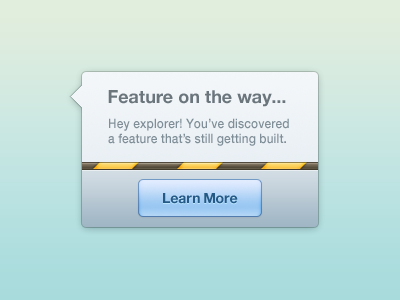
I read an interesting article several days ago by Nick Kishfy of @mojotech. His thesis was that using "buttons to nowhere' allows his team to gauge interest in advance for prospective features by tracking user engagement with temporarily-unavailable interface elements. Upon clicking an unavailable feature, the user would come across a fun little notification like this.
In my interpretation, I've slightly edited the copy, retaining the 'emotional' design. I've also implemented a caution-banner pattern as opposed to an air-mail pattern.
'Buttons to nowhere' could be seen as distracting or hypothetically misleading should the feature never get released. Still, I think the benefits outweigh the costs. The user gets to discover upcoming features and developers and designers get to focus on features that will end up getting used. What do you think of the idea of 'buttons to nowhere'?