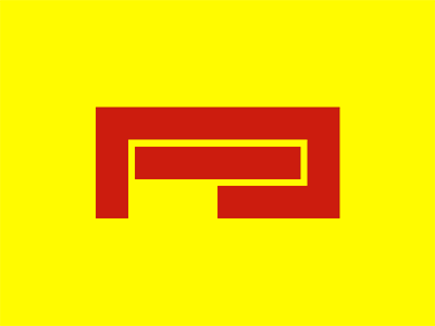
Pirelli
"Pirelli breaks a lot of typographic rules with its overly stretched P; the longer the word, the more horizontal it becomes and the less functional it is. It breaks all conventions. It’s kind of ugly in its weirdness, which probably would have never got through a boardroom now. It’s part of its charm and distinctiveness." Angus Hyland
See attached file for details.
block
bob noorda
ibarrez
identity
logo
massimo vignelli
minimal
p
pirelli
salvatore gregorietti
tyres
View all tags
Posted on
Sep 2, 2013
More by Jacobo Ibárrez View profile
Like


