


Barnwood USA Mark Explorations

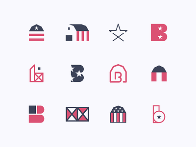


Some mark explorations from the Barnwood USA logo project a ways back. I've wanted to start going back through some of my previous shots and showing the marks that didn't make the cut, whether on the clients side or my own. These were all taken from the initial exploration stage and a handful of these weren't shown for a variety of reasons - either they weren't strong enough marks, were too busy or just didn't work well in a single color. Final attachment shows the final revised mark (color adjustment) selected by the client. I rarely get around to showing what hasn't been selected but what do you guys think? Are you interested in seeing more shots like this?
I'm available for more logo design and brand work. Let's work together!
Follow me on Instagram