


Well and Truly Brand Identity


Well and Truly are a new brand started by two sisters offering something new to the corporate scene. Offering workshops which focus on corporate strategy mixed with mental wellness and health. The brand’s personality encompasses a corporate feel mixed with something modern, fresh and new. All aspects of the brand should portray being energetic, healthy, inspirational, clarity, and holistic.
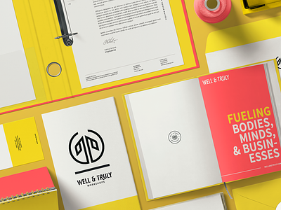
A bold colour selection which gives viewers the feeling of excitement, creativity, inspiration, and empowerment. The palette is inspired by both autumn and spring – a natural transition and period symbolising the shedding of what you no longer need and evolving into something even greater.
The icon encompasses a monogram of the letters W and T for ‘Well & Truly. The icon also shows a tree and roots symbolizing growth and balance. The icon was created from the shape of a circle, two halves coming together both vertically and horizontally – representing balance, coming together, collaboration, and reflection.
A full Brand Manual was created along with brand stationery and a 21-slide presentation template. The photography which is featured on the website was also taken by me as part of the project.