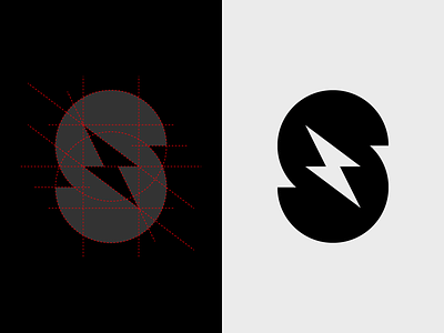
Storm Cards
There’s a part of the brand identity design process that seeks to justify a designer’s gut decisions with reasoning, symbolism, math, grids, etc. Sometimes we do it for clients, sometimes we do it for ourselves. The simpler the mark, the louder the voices demanding justification get.
Does this symbol for Storm Cards map to a well-proportioned grid? Sure. Just look at it. But did I start there? Absolutely not.
In truth I drew two semi-circular thick strokes and two triangles and I moved* them around until they looked right. And I did it in a few minutes because I bought the domain and wanted to put up a splash page to get my butt in gear on finishing the product. How’s that for reasoning?
It’s not pure instinct — the reality is probably closer to instinct informed by a couple of decades of math and experience. But it’s not overwrought design justification either. I like the way it looks and, at least for my own products and projects, that’s good enough for me.
P.S. Storm Cards™ are assistive learning devices for brainstorms and workshops. They’ll be available for purchase soon at storm.cards.
*I will admit that I always use a grid, and I snap to it religiously — until I need to break it.

