Logo Revisions: Chicago Cubs

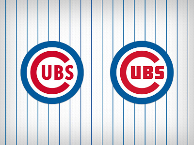

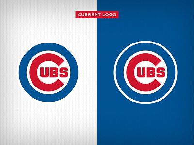
This might sound blasphemous to some, but I've never thought the Cubs' logo set was all that great. The primary logo, in its current state, is bloated, chunky, and totally devoid of white space. I wanted to play with bringing the iconic mark back to a more well-balanced state, closer to what the great Otis Shepard originally had in mind.
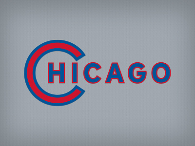
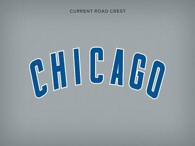
To that end, I tried a couple different typefaces which I feel convey a vintage and timeless quality. I thinned out the 'C' and blue outer circle. I created alternate versions of the mark to sit better in a blue field. I also took a crack at redesigning the road jersey crest, using the same 'C' to hold the city name.
What do you think? Which version(s) do you like better?