Windrush day logo submission

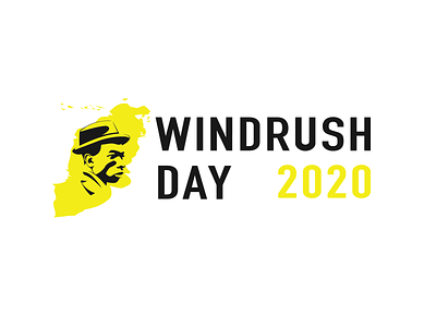
A submission for the Windrush day Logo for use for the next 5 years. I wanted to merge community, identity and heritage into the logo, I merged the West Indies Islands and the mainland UK body into a blended landmass for both origin and giving an idea of merged identities. I wanted to illustrate and original face of a man of the time, with a neutral but driven face, to convey a dignity and honour as well as being a direct icon of the times. I used an adjusted DIN font to match the font used on the original Vessel the Empire Windrush to call back to the heritage and give tribute to the ship and thanks to the people who emigrated to the UK to rebuild. Finally the logo has color variants but sticks to the Caribbean red, yelllow and green. I wanted to have the yellow as the primary however as its the most celebratory and energetic and avoids the complimentary colour route that the red or green can experience.