


CAIM COACHING

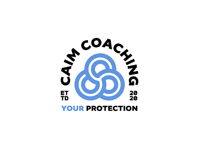


Brand identity for a charity based in the US, which offers therapy, counselling and support for first responders and their families.
Caim is an ancient Gaelic term meaning “invisible circle of protection”.
The crest features a Gaelic-inspired icon of interconnected C’s. The shape itself is a subtle nod to the brand origins and also an Irish clover/shamrock, representing the large Irish contingent that make up the fist responder forces in The USA.