Roar Bikes Website

Bikes website targeted at people looking for practical, unique and unexpected products.
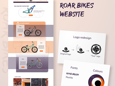
I realised the logo could be easily turned into a "tyre" and I quite like the result.
I tried to choose interesting and various bikes. The heading font matches the theme as it's "handmade" and rough. The purple colour links to the royalty feeling, while the orange brings it down to earth and adds freshness and life. They both associate well with the lion.