


Designing the white space

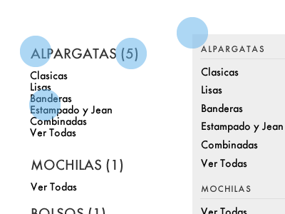

This is a drop-down that allows users to browse products by categories and subcategories. What's shown here is the extensive micro-decisions I made in order to make this component look simple.
1. Original wireframe. Titles too big, count of items no needed, subcategories with poor line-height.
2. Tweaked type treatment for titles, removed count of items, added background. Still little whitespace, looks complex with the added line below each title.
3. Nudged subcategories, removed lines. More whitespace, from 10 pixels of padding to 15 pixels.
4. Color applied. Still some wording/copy issues.
5. Final version. Minimal, simple and straight-forward.
Client: tusguanaco.com
Responsibilities: Information Design, Visual Design.