Mailing Dribbble
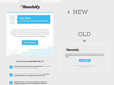
As I mentioned before I did few additional things for Benchify. One was redesigning they email template so it's more friendly, nice and modern looking. As those will be send to users how are not always benchify members i suggested adding few information on bottom (the form is not disturbing, it's cleary less important). This email should be read, thats why i don't mind that the button is not as good presented as on the old version. On other templates (email confirmations for example) I used blue only for the button to suggest main action that we want user to do.
Posted on
Jul 25, 2013
More by Ola Drachal - Zajdzik View profile
Like


