THE ROYAL ONE // GREEK HONEY

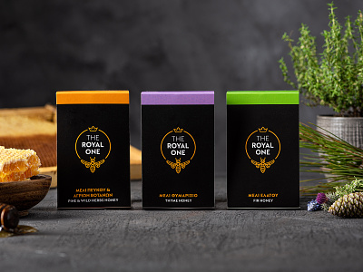


The design of the logo is a minimalistic illustration of a "quality guarantee''. The bee wears her crown and marks the product. The gold-yellow wreath of the logo stands out on the black background. The brand name is written with a strict, Doric style font using exclusively white capital characters.
The packaging follows a modern artistic approach, simple but "fresh". A sleeve embraces the honey jar and makes it stand out on the shelf giving the potential consumer the chance to examine the color and fluidity of the product. The funky color code we chose to use, which includes peach orange, peanut green and lavender purple, enhances the packaging identity of the three varieties of honey produced, that is, Fir Honey, Pine Honey and Wild Herbs and Thyme Honey.