Benchify


See the full project in attachment as there are few interesting things below 300px :) & click "L" for like :D
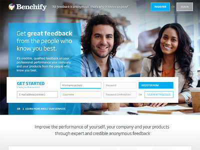
I was commissioned to create new main page for benchify. They had something made few months before but the whole service evolved and it did not match anymore. The old page was dark (grayish) and focused on registration form. Imho it was hard to see that it's a social oriented service and what are really the main benefits of using it.
Now it's more friendly and main info is still very god highlighted.
I choose to use custom/horizontal form. I know it'a maybe not the most popular way of doing it and that some ux guys would hate but it has given the site a lot of needed space and padding and the form itself is easy. I treated it with special care so its still usable, visible and not confusing. I think that I have succeeded.
I suggested creating this special box "3 reasons" as it will help users see the value of using benchify quick (it also helped me to make the design interesting as i used graphs that are created in the system and those are fairly cool looking)
Below there are main features with icons, some styled quotes and place for logos (of companies that use this service).
After creating this "redesign" i was asked to create additional changes in the whole product design so in few days i will send further screens :) I could not make it from scratch of course but some small changes made a colossal difference. Soon you will see for yourself.
... and yes i like to use this guys photos ;)