GM Fraser - Brand Identity Design

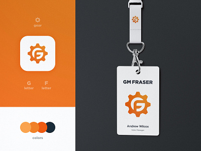

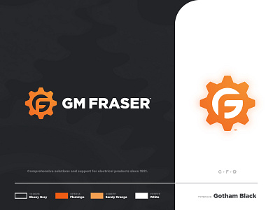
Here's the final result of the rebrand we developed for GM Fraser, a company that does sales and support of electrical components ⚙️
The key colors of the brand remained Orange, with a small reinterpretation that makes it more vivid and in line with the objective. We used Ebony Grey as a secondary color to give more depth to the identity.
The chosen typeface directly correlates to the shape and mood of the logomark as well as to the electrical components industry.
Press 🧡if you liked this seeing this rebrand come to life.
--
📨 Got a project? Let's work together! Email: wisecrafted@gmail.com
--