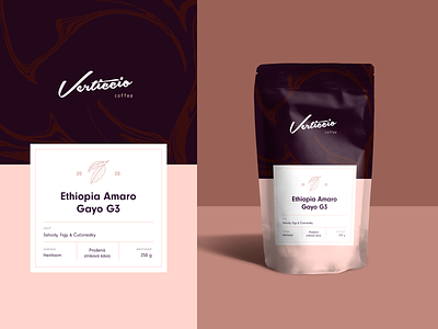
Coffee packaging for Verticcio ☕️
Over time as I design, a lot of things have passed through my hands. Last one is coffee packaging for local roaster Verticcio in design competition. ☕️
My goal was to “feel” the taste of coffee directly from design.
Upper part (brown) symbolize coffe in mug and from lower part (pink) you can feel unique taste - strawberries, figs, blueberries. 🙂
beans
brand
branding
chocolate
coffee
coffeeshop
colors
ethiopia
mockup
package
package mockup
packaging
taste
woman
View all tags
Posted on
May 26, 2020
More by Martin Mroč View profile
Like


