Evomail for iPhone Chrome

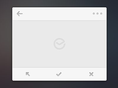
Although I'm not there anymore, here is a snapshot of some of my last work on Evomail. This is the message view chrome. For the nav bar + footer, I went for what I like to call "light" or "minimal" design. In that it's not flat (ugh, I hate that word), nor skeuo. Rather, it's simply a solid balance between the two to solve the problem at hand: giving just enough distinction from the main content while not disappearing in the bg altogether. Shadows FTW!
Top-left is back (also gesture-based), top right is more options. Bottom, from left to right, are label (unique icon that makes sense of both iPhone + iPad [drawer opens from the left]), archive, and trash.
Oh, and you can spot the final logo in the center :)