Kapper Branding 03
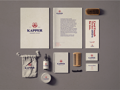
Kapper is a modern barber shop based in Amsterdam, The Netherlands since 2019. They offer exquisite grooming and hairstyling services for men in a cozy, masculine atmosphere. The visual identity we designed for Kapper was purposefully derived from a smart blend of both contemporary and vintage styles, on which the whole brand itself is built. Kapper’s logo is a symbol type along with a neat typography. The symbol consists of the shapes of a mustache, beard and scissors, which effectively communicates the sense of masculinity they aim to address. For Typography, we used a typeface that lays between Sans Serif and Modern Serif. This mix conveys an eye-pleasing harmony of minimalism, modernism and style. Kapper’s color palette consists of distinct shades of dark navy blue, red and grey. This color scheme was precisely picked to support the brand’s core values.. confidence, comfort, reliability. Moreover, these colors make the main colors of the Dutch flag.