Pocket Rocket fitness app

👋 Hey,
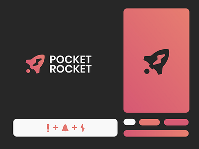
Heres a logo I recently did for a fitness app.
The idea behind it was to emphasize the rocket. This logo was designed to be modern, minimal and neither masculine or feminine, designed for everyone.
The idea of the lighting strike icon was to emphasize energy, the exclamation mark emphasises attention while inside of the rocket since that was part of the name.
https://pocketrocket.fit/
................