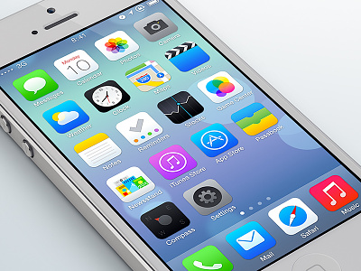
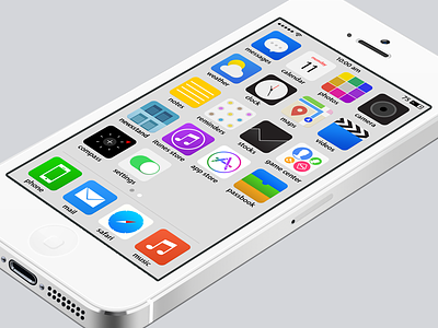
iOS 7 Redesign


Hi Dribbblers, I know there are tons of redesigns, here's one more, sorry for that, but I think it's not going to hurt anybody.
Here are some of my thoughts for this redesign:
• I did some changes to the icons structure and the inner grid. I wanted the icons to be more defined. I say this is because the official apps are too rounded. I thought that we must have a circle or a square, but not some element trying to be both. (this is just my personal view, I like when design is honest). So I decided to make them square, with beautiful rounded corners, but visually they are squares.
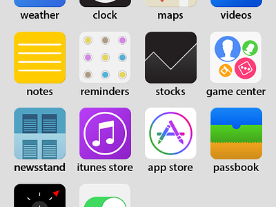
• The "photos" app icon. This is a good example of how I think when I try to create honest design. I think an icon is like looking a complete world through a tiny hole. Yes it's hard to represent an app in a tiny graphic, but if you do it right, you can tap on that icon, your app opens, and if you feel that you got what you expected, then your experience was good, it was transparent, it was sincere, just pure.
The photos app is an abstraction of what's inside the app, not grouped colors trying to be a flower, your photos are grouped in a grid, that's all, nothing more, is simple.
All the icons where made to represent things as they are, and to reflect the experiences that the users will have if they tap them.
• The official camera icon is not a good abstraction, that icon represents other type of cameras. I wanted to represent what your device has if you turn it back. iOS 6 was in a good direction, they got it right, but now they threw it away, don't know why.
• When apple was preparing for the keynote, I saw a photo of a "7" with a great color selection, I was very exited to see that something different was coming and I though that those colors inside the number 7 where powerful in that huge area of white.
The "app store" icon I created, connects with that "7" with the same strategy. I think that the "app store" is the most powerful app we have in our phones. It provide us with the rest of the apps. I thought it was the one to get those powerful colors in the logo and leave a big white space around it. I think it looks pure and coherent with the iOS 7 logo.
• The compass is a really complex icon, because all of the examples I've seen, have a lot of elements or in different positions. It's important to capture a minimal view or a visual reduction of the product without adding things.
I didn't include the letters of the cardinal points, because I think that the app name "compass", delivers a good introduction of the app.
I wanted to get rid of the "dock" idea, what you have are 4 permanent, visible and available apps for you. I make a subtle division, which not pretends to be more than it is. Just a division and the background shouldn't change, it should be the same.
Please, if you have something to say, just go down and tell me what you think. I will continue posting more comments about the process of this redesign.
Thanks for passing by :)